Kalindu Auto
Logo
Branding
Year
2024
Client
Devx10
Role
Designer
Duration
1 Day
Project Overview
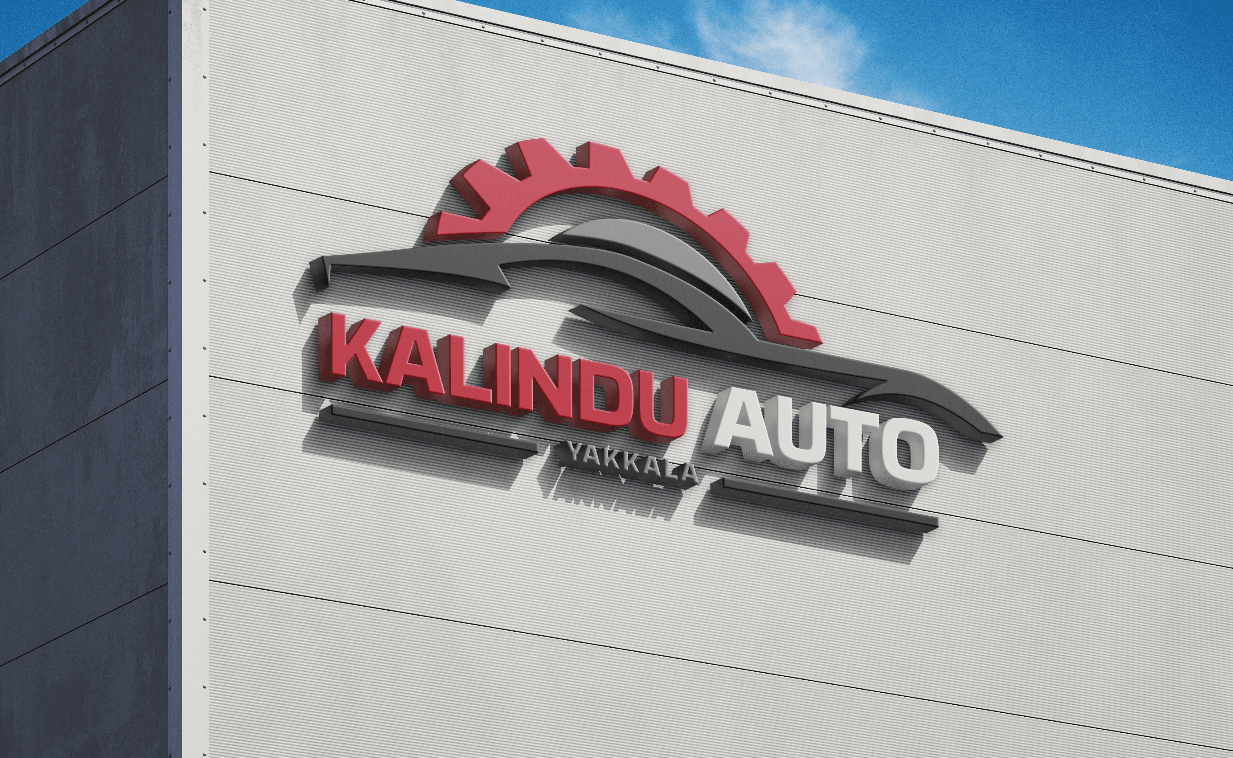
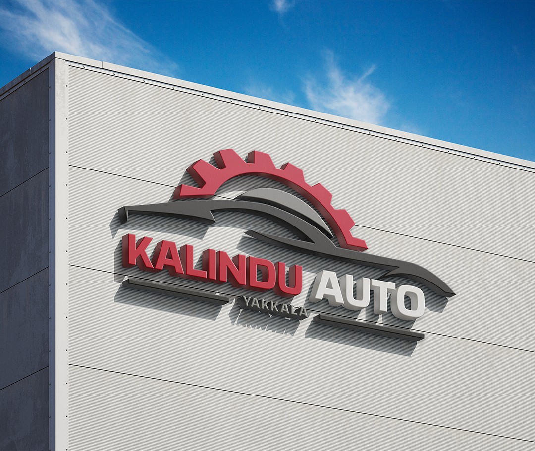
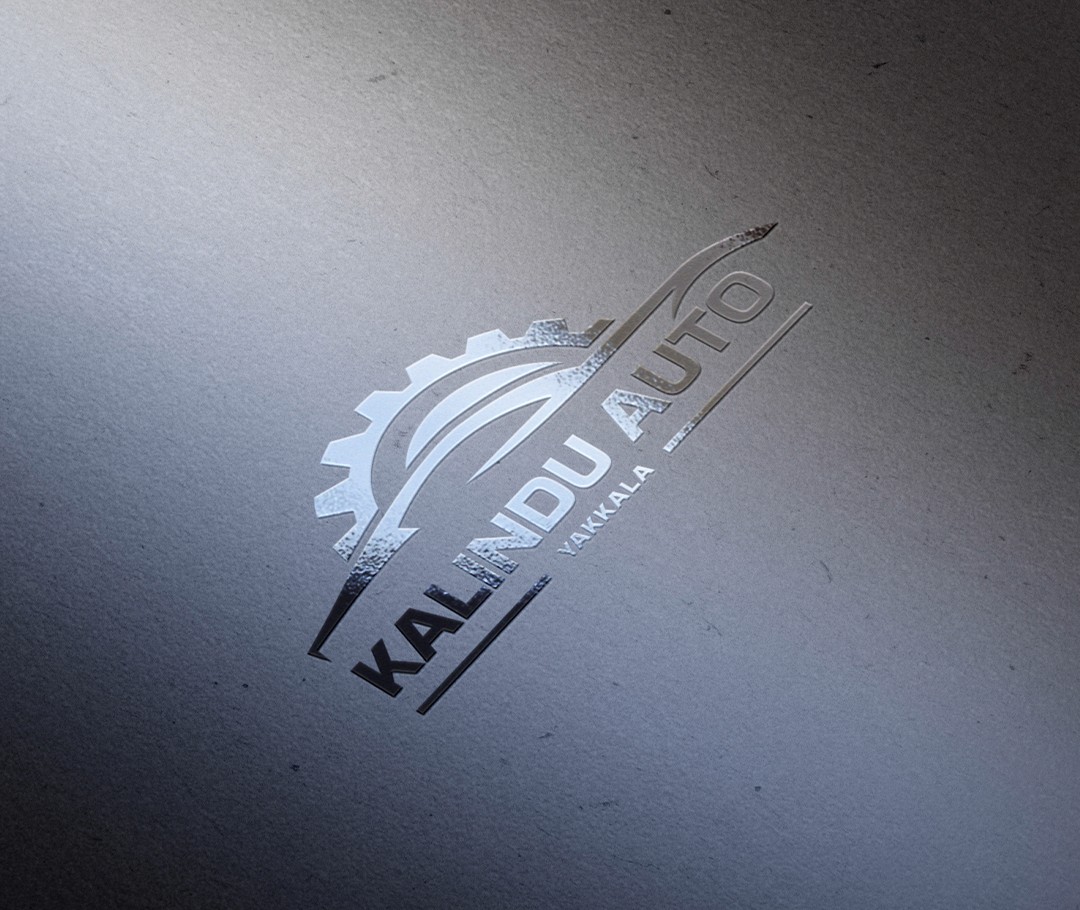
I received this project from the Devx10 team, who were developing a website for Kalindu Auto, an automotive dealership. The client also requested a new logo design as part of the project.
The goal was straightforward: create a modern logo that works effectively across both digital and print media. I designed a clean logo mark that reflects the brand’s industry, the car-shaped element represents motor vehicles while the gear-shaped element symbolizes automotive parts.
For the wordmark and tagline, I used the bold and clear Basement Grotesque Roman font. The wordmark featured the brand name, while the tagline displayed their location.
The color palette included Raspberry Red, Noir Black, Grey, and White Smoke; a combination chosen to ensure strong visual impact, especially in print media.
Kalindu Auto
Logo
Branding
Year
2024
Client
Devx10
Role
Designer
Duration
1 Day
Project Overview
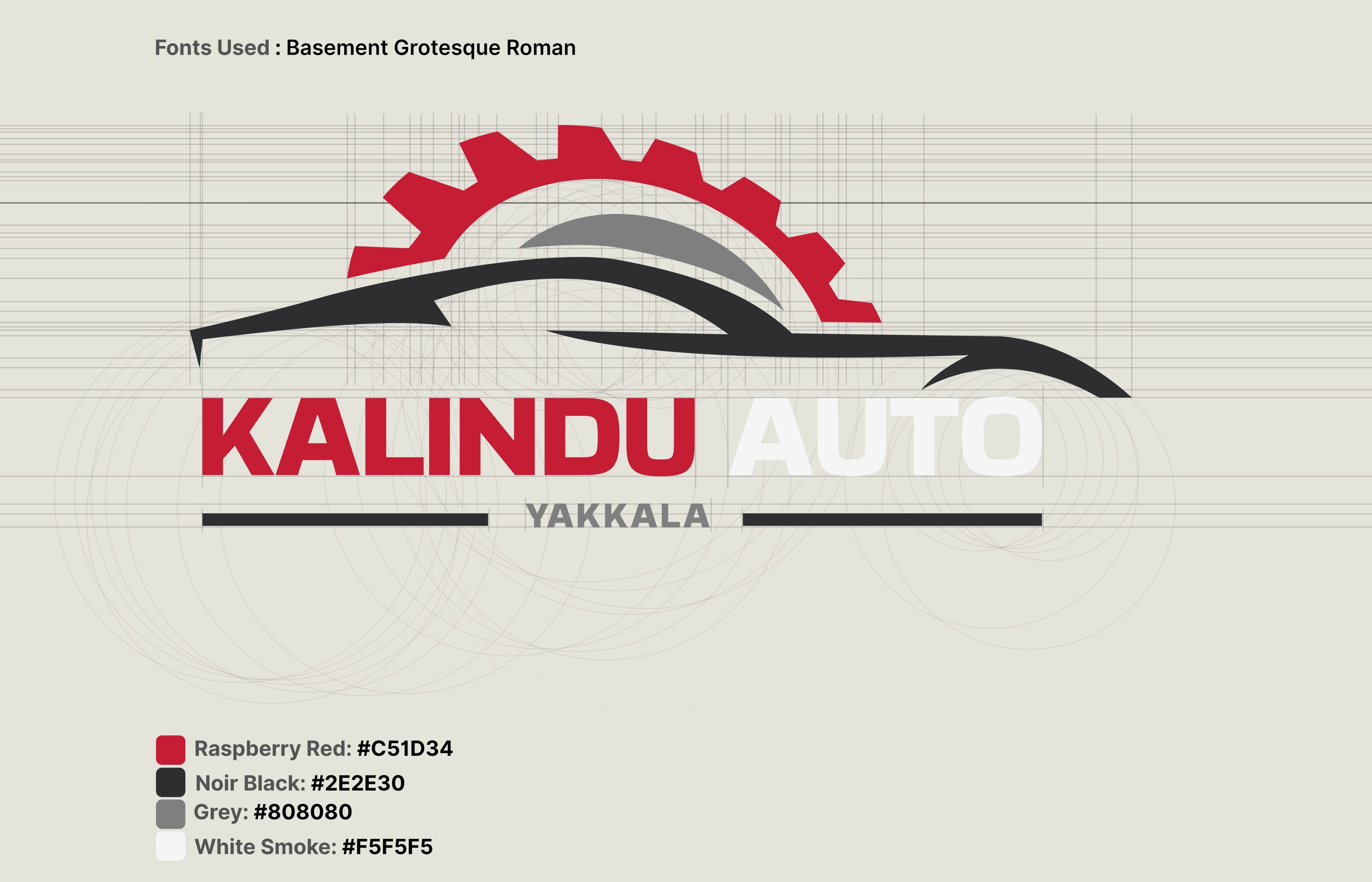
I received this project from the Devx10 team, who were developing a website for Kalindu Auto, an automotive dealership. The client also requested a new logo design as part of the project.
The goal was straightforward: create a modern logo that works effectively across both digital and print media. I designed a clean logo mark that reflects the brand’s industry, the car-shaped element represents motor vehicles while the gear-shaped element symbolizes automotive parts.
For the wordmark and tagline, I used the bold and clear Basement Grotesque Roman font. The wordmark featured the brand name, while the tagline displayed their location.
The color palette included Raspberry Red, Noir Black, Grey, and White Smoke; a combination chosen to ensure strong visual impact, especially in print media.